ShopDreamUp AI ArtDreamUp
Deviation Actions


Suggested Deviants


Suggested Collections


You Might Like…


Featured in Groups


Description
THE PSD IS NOW AVAILABLE FOR ONLY 5$ only on DeviantART
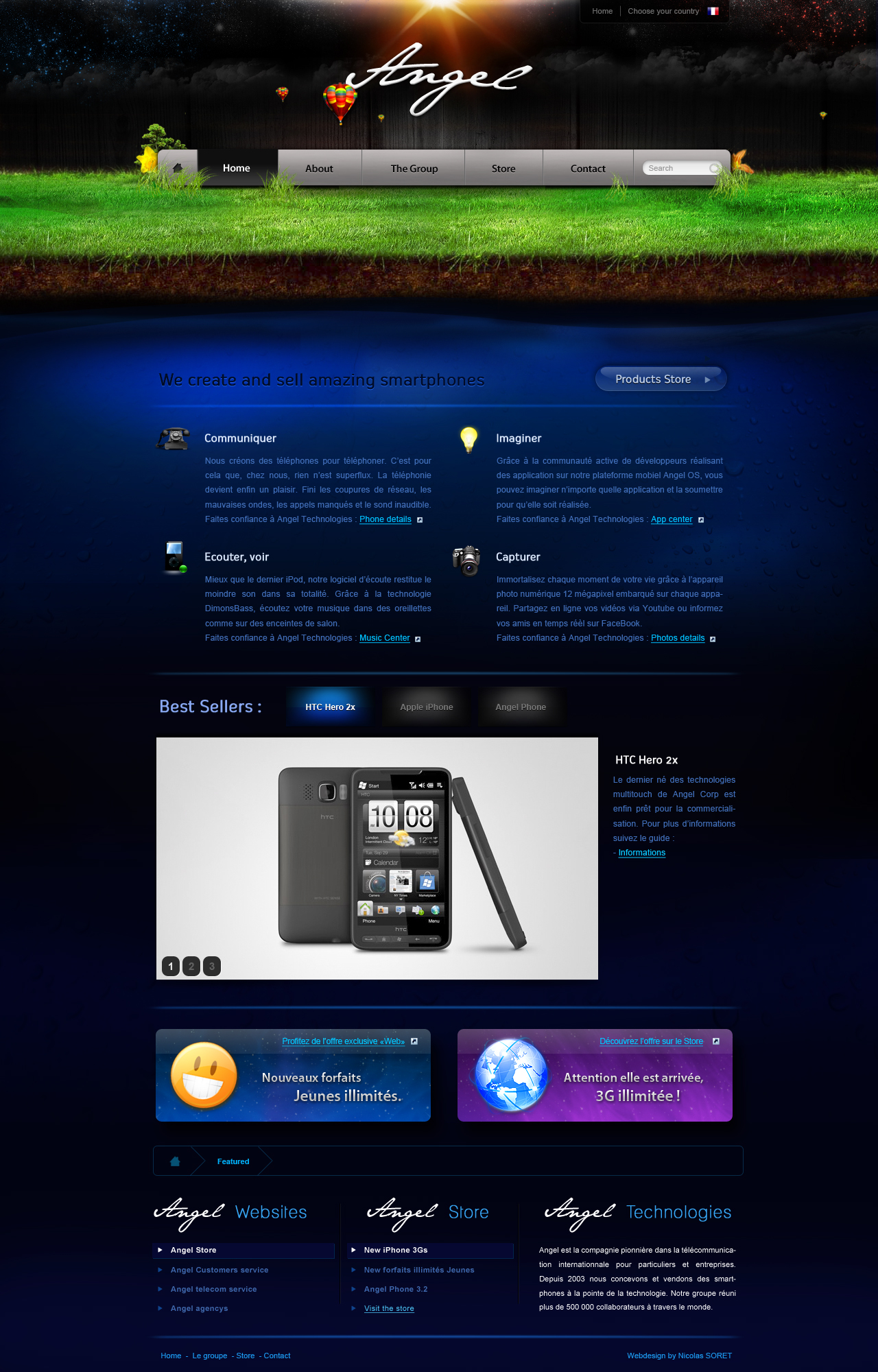
Angel
Web design made for fun. Comment and fav' if you like. Thank you.
Don't hesitate to follow me on twitter for web news : Me on Twitter
Image size
1280x2000px 1.28 MB
© 2009 - 2024 miko434
Comments132
Join the community to add your comment. Already a deviant? Log In
The thing I like most about this layout is the interesting header you've built and the implication of depth and ground. However, I don't see how this layout could stretch horizontally with that grass imagery up there. It doesn't look like it would be that tile-able considering the detail in it. Sad but true.
I also like the logotype you've put together in the header. It feels pretty cool and is very detailed. That said, your header is waaaay too tall. You've got to trim down the vertical height on that, as the nav should always be as close to the top of the page as possible. You've got it pushed down significantly to a place where the page content should technically begin, except it doesn't. Your page's actual content (stuff somebody would want to read) is pushed down the page so far that a common visitor wouldn't even know that the page actually has content. This is especially problematic because it looks like this page is intended to sell things. Can't sell stuff nobody knows about! <img src="e.deviantart.net/emoticons/w/w…" width="15" height="15" alt="
Going back to your nav, it remarkably resembles the nav from apple.com. So much so that at first glance I was certain you'd outright stolen the imagery. But when I checked apple.com I found that you simply ripped off the general formatting, structure, and font style (including using Myriad). Seems very unoriginal to me. If I were you, I'd be embarrassed.
Regarding your typography, the light blue on dark blue text is difficult to read. I do like the iconography that goes with it, though, as that helps to clarify what each paragraph is talking about. I always support icons as I feel they can communicate for more than a simple word or sentence. But back to that typography. Light blue on dark blue is a rough thing. The human eye tends to respond best to dark colors on much lighter colors (like black ink on white paper) so it's best to try to mimic that contrast as much as you can. If I were you, I would reverse the coloring and make the text a very dark dark blue and the background a very light light blue (like a light cyan).
In general I like the attention to detail I see in a lot of this, but there are just these few issues I see that bring the success of the design down a few notches.
Hope all that helps! Take care. <img src="e.deviantart.net/emoticons/s/s…" width="15" height="15" alt="